
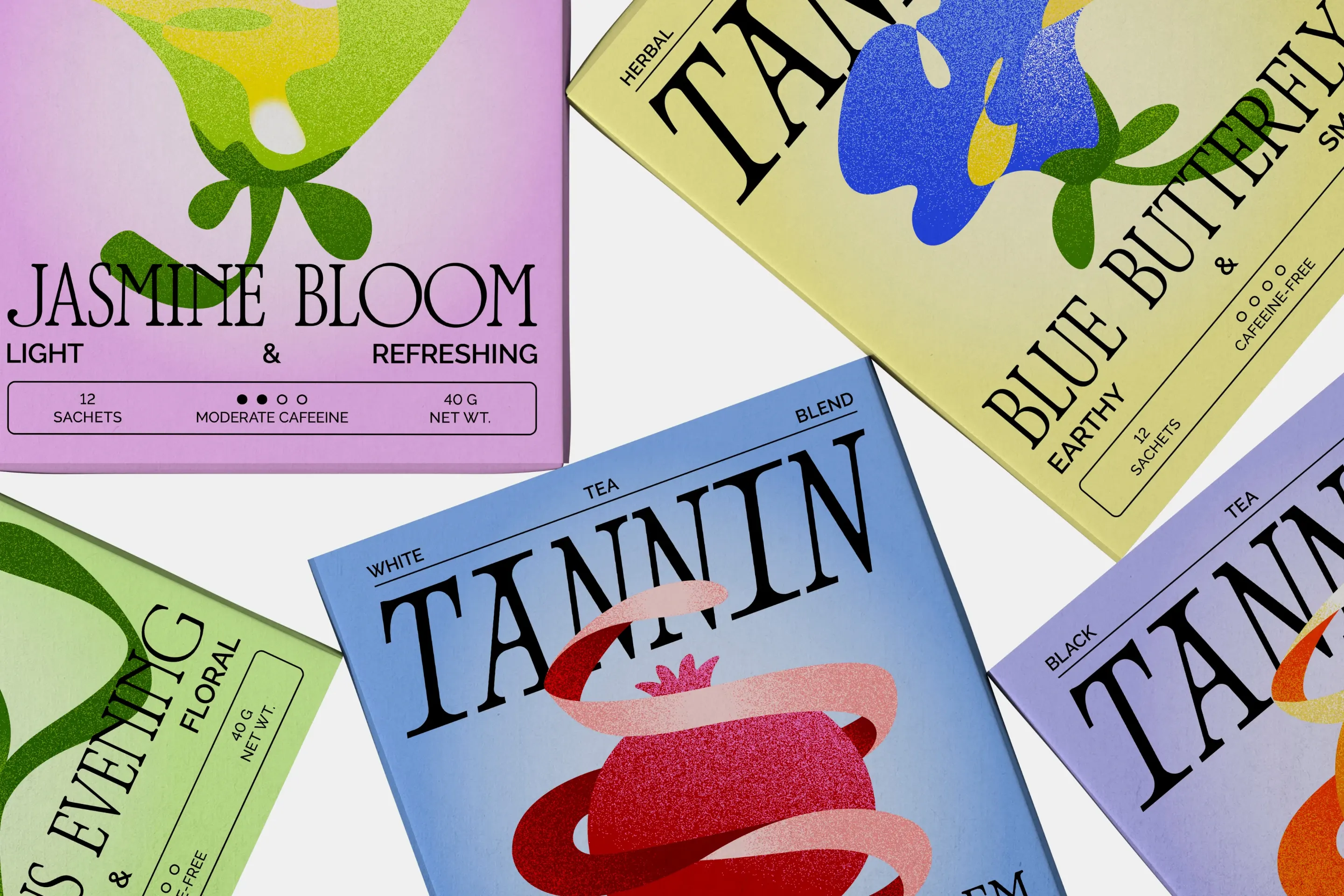
TANNIN takes its name from tannins - natural compounds that give tea its distinct astringency and depth. Through design, the brand captures this same sensation - sharp, vivid, and full of character.
Unlike the traditional perception of tea as something ceremonial or nostalgic, TANNIN brings it into the modern city - making tea feel as effortless and relevant as coffee. The idea was to reframe tea as part of urban life: bold, expressive, and dynamic.
The packaging reflects this vision through bright colors, textured abstract illustrations, and a serif logotype reinterpreted with modern sharpness and contrast. Illustrations overlap the logo, symbolizing how tea merges with the rhythm of the city.
Beyond packaging, TANNIN extends into a physical tea space - a minimal, modern environment designed for vibrant everyday life. It’s tea without ceremony - just bold flavor and bold design.
.webp)
.webp)
.webp)
.webp)
.webp)
.webp)
.webp)
.webp)